



TL;DR:
- Death metal shirt aesthetics are characterized by dark colors, visceral imagery, and slime-motif typography that reflect themes of decay and rebellion. High-quality shirts use heavyweight cotton and hand-illustrated artwork to preserve authenticity and cultural significance. Proper design and material choices ensure long-term value and cultural integrity within the metal community.
Death metal shirt aesthetics are defined by dark, visceral imagery and chaotic typography that represent themes of decay, gore, and rebellion. Understanding death metal shirt aesthetics means reading a visual language built on specific colour palettes, hand-drawn lettering, and symbolic imagery that has evolved since the genre’s origins in the mid-1980s. These shirts are not random graphic tees. They are cultural artefacts that carry the identity of a band, a community, and a philosophy. For fans and collectors, knowing what separates a well-crafted design from a cheap imitation is the difference between owning a piece of metal history and buying a costume. Vintage Metal Store curates authentic vintage and tour stock that honours this tradition.
What are the key visual elements in death metal shirt design?
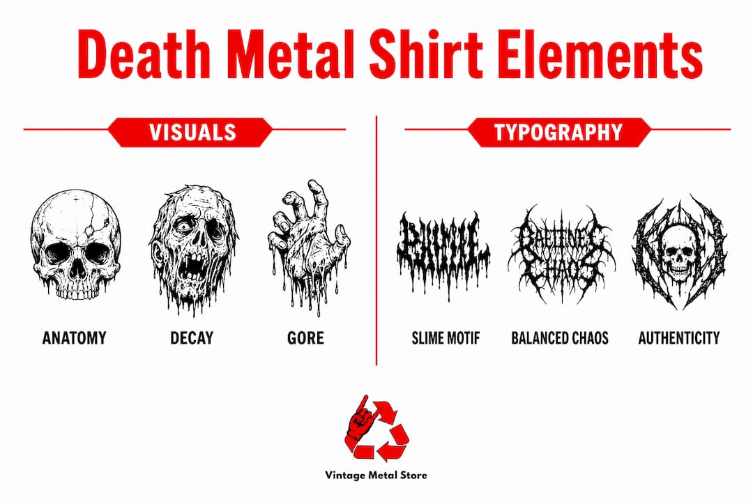
Death metal shirt design relies on a tight set of visual rules that distinguish it from every other metal subgenre. The colour palette centres on black, deep reds, and sickly greens. These colours are not chosen for style alone. They reference decay, blood, and biological rot, which are the thematic core of the genre.

The imagery pushes further. Anatomical drawings, decomposing figures, and gore-heavy scenes appear across the chest and back panels. These visuals draw from horror film aesthetics, medical illustration, and occult symbolism. The goal is visceral impact, not decoration.
Fabric choice matters as much as the print. 220 GSM heavyweight cotton is the recognised standard for durable band merchandise. That weight gives the shirt a substantial feel and holds screen-printed ink without cracking or fading after repeated washing.
Key visual elements that define the aesthetic include:
- Colour palette: Black base with deep red, sickly green, and bone white accents
- Imagery: Anatomical decay, gore, horror figures, and occult symbols
- Print style: Hand-illustrated raster artwork rather than clean vector graphics
- Fabric: 220 GSM heavyweight cotton for durability and authentic feel
- Back panel: Full-back artwork is standard, often more detailed than the front logo
Pro Tip: Test any print design on a dark fabric swatch before committing to a full run. Sickly greens and deep reds can shift dramatically under stage lighting versus natural daylight.
Hand-drawn raster images preserve the organic texture that defines genuine death metal aesthetics. Crisp vector artwork looks too polished and reads as inauthentic to collectors who know the difference.
How does death metal shirt typography distinguish the aesthetic?
Typography is the single most recognisable element in death metal shirt design. The slime motif style uses thick, bulbous, dripping letters that mimic rotting tissue. The letters appear to melt, bleed, or decompose. That visual instability is intentional. It mirrors the sonic chaos of the music itself.
Great death metal typography walks a precise line between chaos and structure. Designers aim for a 50/50 balance. Too much chaos and the logo becomes an unreadable smear. Too much structure and it loses the aggression that makes the genre recognisable. The best logos, from bands like Cannibal Corpse and Obituary, achieve both simultaneously.
The most common technical failure in death metal logo design is ignoring negative space. Professional logos maintain open counters inside letters so they do not collapse into dark blobs when printed small. This is called preserving the counter, the enclosed or partially enclosed space within a letterform.
Follow these steps when evaluating a death metal logo for quality:
- Thumbnail test: Reduce the logo to 50 pixels wide. If you cannot read the band name, the counters have failed.
- Light condition test: View the logo under both bright light and dim conditions. Excessive micro-cuts cause logos to become illegible under stage lighting.
- Style check: Confirm the font draws from anatomy and decay, not occult minimalism. Mixing drippy death metal fonts with black metal design elements is a common error that undermines both styles.
- Scale test: Check the logo at actual merch size, not just on screen. What reads clearly at A4 can collapse at chest-print dimensions.
Pro Tip: If you are assessing a vintage shirt for authenticity, compare the logo to known original pressings. Bootleg shirts often get the counter spacing wrong, which is the fastest tell.
Avoiding style-mixing preserves authenticity and the integrity of death metal visual identity. Each metal subgenre has its own typographic grammar. Mixing them signals either ignorance or laziness, and collectors notice immediately.
What cultural meanings do death metal shirt designs convey?
Death metal shirts function as tribal symbols. Wearing one communicates allegiance to a specific band, a subgenre, and a set of values that sit well outside mainstream culture. Metal merchandising thrives on tribal identity, with fans buying multiple merch types to reinforce belonging and visual identity. The shirt is not just clothing. It is a declaration.
The themes embedded in the designs carry real meaning. Decay, defiance, and mortality are not shock tactics alone. They reflect a philosophical stance that refuses to sanitise death or pretend suffering does not exist. For many fans, wearing these images is an act of honesty about the human condition.
Officially licensed merchandise carries additional cultural weight. Merch can account for over 50% of a band’s income at live shows, which means buying authentic product directly supports the artists. Bootleg shirts undermine that relationship and dilute the cultural integrity of the design.
The role of the shirt as a walking advertisement within the metal community is well established. A fan wearing a rare 1990s tour shirt at a gig signals knowledge, history, and commitment. That shirt becomes a conversation starter, a credential, and a collectible artefact simultaneously.
Key cultural functions of death metal shirts include:
- Identity marker: Signals membership in a specific band’s community and the broader death metal scene
- Revenue support: Directly funds bands, especially independent acts without major label backing
- Historical record: Tour shirts document specific eras, line-ups, and artistic periods in a band’s history
- Collectible value: Limited edition and tour-exclusive prints appreciate in value over time
- Visual ambassador: A well-designed shirt cements long-term fan loyalty and extends a band’s visual reach beyond the stage
Understanding metal band merchandise through this lens changes how you approach buying and collecting. Every shirt has a story attached to it.
How do you identify and evaluate quality death metal shirts?
Quality in death metal shirts comes down to three factors: fabric weight, print authenticity, and design integrity. A shirt that fails on any one of these is not worth collecting at a serious level.
Fabric is the foundation. Premium 220 GSM cotton is the preferred standard in the Australian market for both streetwear and merch longevity. Lighter fabrics pill faster, hold less ink, and feel cheap against the skin. When you pick up a shirt and it feels thin, that is your first warning sign.
Print authenticity separates genuine band merchandise from mass-produced graphic tees. High-quality death metal shirts use hand-illustrated artwork rather than digitally generated imagery. You can often see the texture of the original illustration through the ink. That organic quality is impossible to fake convincingly at scale.
For collectors, checking the design evolution of vintage shirts against known original pressings is standard practice. Tour dates, venue lists, and catalogue numbers on the back panel all help verify authenticity and date a shirt accurately.
| Feature | What to look for | Red flag |
|---|---|---|
| Fabric weight | 220 GSM or heavier cotton | Thin, lightweight fabric that stretches easily |
| Print quality | Hand-illustrated, textured ink | Flat, digitally smooth, or pixelated artwork |
| Logo legibility | Clear counters, readable at thumbnail size | Dark smear with no distinguishable letterforms |
| Design style | Consistent death metal visual grammar | Mixed subgenre fonts or generic horror imagery |
| Provenance | Tour dates, year, official licensing marks | No band or tour information on the garment |
Limited edition and tour-exclusive prints carry the highest collectible value. A shirt from a specific tour run, especially one that was only available at the venue, documents a moment in a band’s history that cannot be replicated. That scarcity is what drives serious collectors to platforms like Vintage Metal Store.
Key takeaways
Death metal shirt aesthetics combine hand-illustrated gore imagery, slime-motif typography, and 220 GSM heavyweight cotton to create a visual language that is as culturally specific as the music itself.
| Point | Details |
|---|---|
| Colour palette is symbolic | Deep reds, blacks, and sickly greens reference decay and gore, not random style choices. |
| Typography follows strict rules | Slime-motif fonts must balance chaos and legibility, with open counters to stay readable at merch size. |
| Shirts are cultural artefacts | Officially licensed merch supports artists directly and documents specific eras in band history. |
| Fabric weight signals quality | 220 GSM heavyweight cotton is the recognised standard for durable, authentic band merchandise. |
| Style-mixing destroys credibility | Mixing death metal fonts with black metal design elements undermines both aesthetics and collector value. |
Why the design craft behind these shirts deserves more respect
I have been handling vintage metal shirts for long enough to know that most collectors focus on the band name and miss the design entirely. That is a mistake. The visual language of death metal shirts is as deliberate and codified as any fine art movement. The designers who created the original Cannibal Corpse and Morbid Angel artwork were not just drawing gore. They were building a visual identity that would outlast most of the bands they worked for.
What strikes me most is how well the best designs age. A shirt from a 1992 tour still reads as unmistakably death metal because the visual grammar has not changed. The slime motif, the anatomical imagery, the black base with deep red accents. These are not trends. They are the genre’s permanent visual vocabulary. That consistency is rare in any creative field.
The thing collectors often overlook is the relationship between design integrity and long-term value. Shirts with compromised logos, mixed subgenre aesthetics, or lightweight fabric do not hold their worth. The ones that appreciate are the ones where every element, from the hand-illustrated artwork to the heavyweight cotton, was executed with intention.
My honest advice is to treat understanding the design as seriously as you treat knowing the discography. When you can look at a shirt and read the typography, identify the print technique, and place it in the band’s visual history, you are not just a fan. You are a custodian of the culture. That knowledge is what separates a collection from a pile of old shirts.
For anyone serious about collecting, the band t-shirt collecting guide at Vintage Metal Store is worth your time. It covers the practical side of what makes a shirt worth holding onto.
— David
Authentic death metal shirts at Vintage Metal Store
Vintage Metal Store carries rare, authentic death metal shirts sourced from ex-tour stock and deadstock, the kind of pieces that document real moments in metal history.
Every shirt in the collection is assessed for fabric quality, print authenticity, and design integrity before it goes up. If you are after something specific, the vintage Archspire band shirts collection is a strong starting point for technical death metal collectors. For something with broader historical weight, the rare Metallica 1992 tour tee represents exactly the kind of documented, era-specific piece that serious collectors pursue. Browse the full range at Vintage Metal Store and wear the legacy.
FAQ
What defines death metal shirt aesthetics?
Death metal shirt aesthetics are defined by a combination of dark colour palettes (black, deep red, sickly green), hand-illustrated gore and anatomical imagery, and slime-motif typography with dripping, bulbous letterforms. The visual language references decay, mortality, and rebellion as core themes.
What fabric is standard for quality death metal shirts?
220 GSM heavyweight cotton is the recognised standard for durable band merchandise. This weight holds screen-printed ink without cracking and gives the shirt a substantial, authentic feel.
How do I spot a bootleg death metal shirt?
Check the logo’s counter spacing first. Bootleg shirts frequently get the negative space inside letterforms wrong, causing the logo to collapse into an unreadable dark smear. Thin fabric and digitally smooth artwork are additional warning signs.
Why does typography matter so much in death metal design?
Typography is the most recognisable element in death metal visual identity. The slime-motif style must balance chaos and legibility, and mixing it with black metal or other subgenre fonts is a common error that undermines the design’s authenticity and collector value.
Are death metal shirts worth collecting?
Tour-exclusive and limited edition death metal shirts appreciate in value over time because they document specific eras in a band’s history. Officially licensed shirts on heavyweight cotton with hand-illustrated artwork hold their worth far better than mass-produced alternatives.
Recommended
- Vintage Heavy Metal Shirts: $3.2B Market & Design Evolution – Vintage Metal Store
- 1990s Heavy Metal Shirts: 150% Value Surge & Iconic Designs – Vintage Metal Store
- Metal subgenres and vintage shirt designs guide 2026 – Vintage Metal Store
- Heavy Metal T-Shirt Eras: Why Rarity Matters – Vintage Metal Store


