



Recognising an era-specific metal shirt comes down to reading four things together: the artwork style, the print method, the tags and construction, and the tour or production details on the garment. No single clue proves a date on its own. Combined, they’ll get you within a few years almost every time.
Here’s your phone-ready checklist for when you’re staring at a listing photo or holding a shirt at a swap meet:
- Artwork style — hand-illustrated horror imagery reads older than clean digital vector art
- Logo form — angular, blocky lettering (especially Teutonic thrash logos) points to late 80s/early 90s thrash
- Ink texture — raised, glossy plastisol vs soft, faded-in discharge print
- Tag brand — Screen Stars, Fruit of the Loom, Hanes, Stedman or Anvil, each with its own timeline
- Country/label clues — printed origin tags narrow manufacturing windows
- Back-print tour list — a complete list of dates is often your strongest single piece of evidence
- Obvious red flags — perfectly flat modern inks, brand-new tags, suspiciously crisp registration
David at Vintage Metal Store has spent years matching these details across genuinely old stock, and the pattern holds: the shirts that check out are the ones where every clue agrees.
Key Takeaways
Dating a vintage metal shirt accurately requires cross-checking artwork style, print method, tag construction and tour back-lists together, since no single clue is conclusive on its own.
| Point | Details |
|---|---|
| Combine four clue types | Match artwork style, print method, tag/construction and tour lists before settling on a date. |
| Print method signals era | Plastisol, discharge, simulated process, puff and foil each point to different manufacturing periods. |
| Tags narrow the window | Screen Stars, Fruit of the Loom, Hanes, Stedman and Anvil tag formats changed noticeably over time. |
| Tour lists beat guesswork | A complete back tour list matched to a printer credit is stronger evidence than style alone. |
| Buy from vetted stock | Vintage Metal Store checks tags, print methods and provenance before listing any shirt for sale. |
Where to check the details yourself
- Defining era in collectible t-shirts — Vintage Metal Store’s era taxonomy
- Explaining band tour years — matching tour lists to dates
- Thrash Metal logo styles — logo geometry reference
- Custom graphics in vintage restoration — period-accurate restoration practice in another craft
Table of Contents
- Visual hallmarks by era: what changed decade by decade
- What printing methods tell you about a shirt’s age
- How tags, labels and construction narrow the date
- Reading production marks and tour back-lists
- Spotting reproductions, restorations and tag swaps
- A repeatable workflow for checking any shirt
- Shop vetted vintage stock instead of gambling on unverified listings
- Sources
- FAQ
Visual hallmarks by era: what changed decade by decade
The rough decade map looks like this: 1970s shirts favour simple band photos and big block text, 1980s shirts go heavy on illustrated horror and thrash motifs, 1990s shirts lean into abstract death-metal logos and darker palettes, and 2000s shirts clean up into sharper, more digital-looking artwork.
Seventies metal merch borrowed straight from rock tour merch conventions: single-colour prints, a band photo or simple wordmark, minimal illustration. By the mid-80s, thrash and death metal exploded visually. Artists leaned into gore, demons, and apocalyptic scenes, often across the full front or back panel. Some of these 1980s thrash designs — think the more graphic Slayer and Megadeth prints from that run — are exactly why original pressings now command serious money among collectors.
Logo geometry tells its own story. Thrash logos tend toward extreme angularity and blockiness, with Teutonic thrash bands favouring rigid, fixed angles over anything symmetrical or rounded. Death metal pushed further into illegible, jagged lettering by the early 90s. By the 2000s, a lot of bands had swapped hand-drawn logos for cleaner vector work, sometimes with metallic gradients that simply didn’t exist on 80s presses.
A few visual traits worth training your eye on:
- Mascots and recurring characters (skulls, demons, band-specific figures) often shift style across reissues
- Colour palettes get darker and more desaturated through the 90s compared to the brighter 80s prints
- Composition moves from centred single graphics toward full-wrap, multi-panel artwork by the 2000s
Vintage Metal Store’s own era classification guide breaks this taxonomy down further if you want a deeper reference for cataloguing your own collection.
Pro Tip: Zoom into the logo’s letter joins and serifs before anything else. Reissued logos are often traced from an original, and tracing rounds off sharp angles and thickens thin strokes. An original 80s thrash logo usually has crisper, more inconsistent linework than a modern reprint of the same design.
What printing methods tell you about a shirt’s age
Five print methods do most of the talking on vintage metal shirts: plastisol, discharge, simulated process, puff, and foil or metallic inks. Learn to spot each one and you’ve solved half the dating puzzle before you’ve even flipped the tag.
Plastisol sits on top of the fabric with a slightly raised, glossy finish. It’s been the workhorse ink for band merch since the late 1970s, and it’s why so many 80s and 90s shirts still show thick, vivid colour decades later. Discharge printing does the opposite: it removes the fabric’s original dye and replaces it with pigment, so the print sinks into the weave rather than sitting on it. That gives a soft, worn-in hand feel that’s frequently mistaken for natural fading, and it turned up often on softer-feel 90s runs.
Simulated process printing fakes a photographic gradient using a handful of solid ink colours layered in halftone dots, rather than true four-colour separations. Puff printing uses an additive that expands under heat, leaving a raised, foam-like texture. Foil and metallic inks add a reflective, almost mirror-like finish that simply didn’t exist on early single-colour screenprints.
Quick checks you can run right now:
- Feel the print edge — plastisol has a defined raised edge, discharge doesn’t
- Hold the shirt up to strong light and look for translucency where discharge ink has soaked through
- Magnify any gradient artwork — genuine halftone separations show consistent dot patterns, while simulated process often looks slightly muddier or inconsistent under a loupe
- Check for cracking — plastisol cracks in sheets over decades, while discharge rarely cracks because it’s part of the fabric
- Look for raised or reflective texture inconsistent with the shirt’s claimed decade — puff and foil on a “1975” shirt is a warning sign, not a bonus feature
- Inks that flake in flat chips are almost always plastisol
- Inks that fade evenly into the fabric with no flaking are typically discharge
How tags, labels and construction narrow the date
Three signals do most of the heavy lifting here: the brand tag itself, the wording on the care label, and the country of manufacture printed inside the collar.
Screen Stars tags shifted format multiple times through the 80s and 90s, moving from simple printed tags to more detailed woven versions with care instructions. Fruit of the Loom and Hanes both moved from basic printed neck tags toward RN-numbered, multi-language care labels as manufacturing regulations tightened through the 90s. Stedman and Anvil tags tend to show up more on mid-to-late 90s tour runs, often paired with sewn-in (rather than printed) care instructions.
Beyond the tag itself, check construction:
- Single-needle stitching generally predates the more common overlock seams of later mass production
- Collar height and rib thickness shifted noticeably through the 90s toward slimmer collars
- Fabric weight tends to run heavier on genuine 80s and early 90s cotton compared to thinner 2000s blends
- Photograph the tag straight on, in good light, before comparing it to reference examples
- Check whether the care label material matches the era claimed by the seller
- Note any obvious tag replacement stitching around the collar seam
Reading production marks and tour back-lists
Printer credits, copyright years and complete tour back-lists are the strongest production evidence you’ll find on a shirt. Design style alone can mislead you. A printed date can’t.
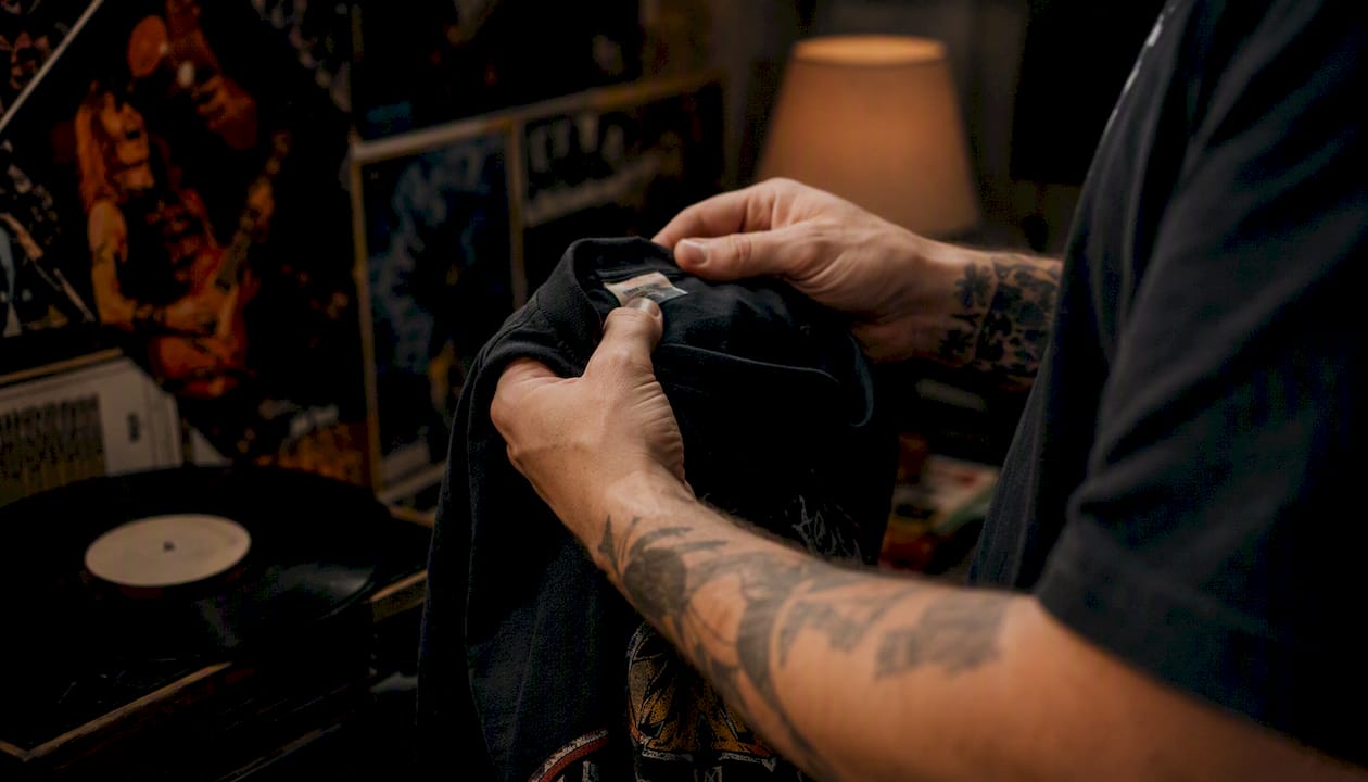
Look for small copyright lines, usually printed near the hem or under the main graphic, showing a year and sometimes a licensing company name. Cross-reference that year against the tour dates listed on the back. A complete, unbroken back tour list matched against a genuine printer credit is disproportionately more reliable for pinning down a precise date than judging artwork style alone.
Watch the layout too:
- Front-left chest prints paired with full-back tour lists were common tour merchandise formats through the 80s and 90s
- Full-front artwork with no back print often signals retail merchandise rather than actual tour stock
- A tour list that’s missing dates a real tour is known to have included usually means a later reprint or a shortened reissue design
- Cross-check any tour list against known concert archives or label press releases before trusting it as original
- Treat mismatched or oddly abbreviated venue names on a back-print as a signal to dig further
Spotting reproductions, restorations and tag swaps
The most common red flags are perfectly flat, crack-free inks on a supposedly decades-old shirt, modern-format tags, mismatched sizing information, and prices that seem too good for the claimed rarity.
Watch for tag stitching that looks noticeably newer or tighter than the surrounding garment seams. Heat-pressed transfers tend to sit flush with zero texture and often show a faint rectangular outline under raking light or UV. Re-dyed shirts frequently show colour pooling in the seams that doesn’t match the rest of the fabric.
- Suspiciously perfect print registration on a design that should show decades of wash wear
- Care labels listing modern fibre blends or washing symbols that didn’t exist in the claimed era
- A tag that looks stitched in with fresh thread against otherwise aged seams
A repeatable workflow for checking any shirt
Run every potential purchase through the same sequence, in this order, and you’ll catch most problems before money changes hands.
- Review every listing photo closely, including tag, collar and any print close-ups
- Check the tag brand and format against known timelines for Screen Stars, Fruit of the Loom, Hanes, Stedman or Anvil
- Identify the print method and check it’s consistent with the claimed decade
- Ask the seller for provenance — where did the shirt come from, and do they have any purchase history
- Cross-check any tour list or copyright year against known concert dates
- Flag anything inconsistent and request more photos before committing
- Get a second opinion from an experienced collector if the value is significant
Ask sellers directly for high-resolution tag photos, close-up shots of the ink edge under natural light, and whatever provenance they can offer, even if it’s just “bought at the show in 1994.” If the provenance story doesn’t match the physical evidence, or a seller can’t produce clear tag photos on request, that’s your cue to walk away rather than talk yourself into it.
Keep a simple record for every shirt you buy: seller details, purchase date, photos of tags and prints, and any provenance notes. That record becomes real value if you ever sell the shirt on, and Vintage Metal Store’s collector’s guide to spotting and valuing vintage tees covers how that documentation affects resale price.
A lesson from the shop floor
I’ve watched a “mint 1987” shirt fall apart under a loupe once the print showed zero cracking and the tag had fresh stitching. Conservative dating and good photos beat confident guesswork every time.
Shop vetted vintage stock instead of gambling on unverified listings
Every shirt Vintage Metal Store lists goes through the same checks laid out in this guide before it ever reaches a product page: tag and print method verification, provenance questions to the seller, and honest disclosure of any restoration work.

That vetting process is the real difference between buying from Vintage Metal Store and gambling on an unverified marketplace listing. You’re not doing the tag comparison and print-edge inspection yourself. It’s already done, with restoration notes disclosed upfront rather than left for you to discover after the sale. Browse the rare vintage heavy metal concert shirts collection for higher-value verified pieces, or check the vintage Metallica shirts category if you’re after a specific band. If you’ve got a shirt in hand and you’re unsure of its era, get in touch and we’ll help you work through the same checklist.
Sources
FAQ
What’s the fastest way to spot an era-specific metal shirt?
Check the tag brand, print method and back tour list together. Artwork style alone can mislead you, but all three clues rarely lie at once.
Does plastisol ink mean a shirt is older?
Not on its own. Plastisol has been the standard ink since the late 1970s, so it confirms nothing beyond a broad manufacturing window without other clues.
Why do tour back-lists matter so much for dating?
A complete, unbroken tour list matched against a printer credit or copyright year is one of the most reliable single pieces of dating evidence available.
How does Vintage Metal Store verify a shirt’s era before listing it?
Vintage Metal Store checks tag format, print method and available provenance, then discloses any restoration work before the shirt goes up for sale.
What’s the biggest red flag on a supposedly vintage shirt?
Perfectly flat, crack-free ink on a design claimed to be decades old, paired with a modern-format tag, is the clearest sign of a reproduction.
Recommended


